


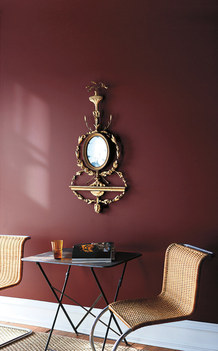
What Paint Sheen Should I Use?
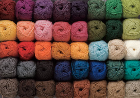
So you’ve selected a paint color! But now you've got another decision to make, what sheen to use. You pull out the little chart that shows the gloss levels increasing, but where to start? You decide that semi gloss is durable, and buy enough for your walls, ceiling, and moldings, one easy decision - right?
So you’ve selected a paint color! You’ve even done your research on what brand of paint to buy that will keep your home healthy! (Check out my last blog post “What's in Your Paint?”) But now you've got another decision to make, what sheen to use. You pull out the little chart that shows the gloss levels increasing, but where to start? A quick Google search will tell you to never paint your walls in high traffic areas with anything less than semi gloss. So you decide that semi gloss is durable, and buy enough for your walls, ceiling, and moldings, one easy decision - right?
YIKES - this is a disaster waiting to happen. You’re going to end up with a shiny, reflective envelope full of imperfections. I guarantee you will not be happy with this choice.
I see this dilemma far too often with home owners. Choosing the right finish the first time can save you time, money and headaches.
Many factors go into selecting the perfect sheen for your application. First, let’s review the basics of sheen. Keep in mind, every paint company will have a different version of these terms and the order of increasing sheen intensity may vary.
The Basics of Paint Sheen
Flat Paint/Matte Paint - No Shine
Flat paint provides a rich depth of color and is great for less than perfect surfaces. Flat paint has the most pigment and will provide the most coverage. Since there is no shine, the light is absorbed rather than reflected. Matte paint is one step up in sheen from flat, but still very low luster. Typically, Flat or Matte finish is the least cleanable option and not good for high traffic areas.
Eggshell - Slight Luster
Not surprisingly, this finish is similar to egg shells. Eggshell offers a real depth of color with a soft and polished look. Good quality Eggshell paint is easy to clean, covers wall imperfections nicely, and is good for moderate to high traffic areas.
Satin - Velvety Luster
Satin is easy to clean, great for high traffic areas, but shows imperfections on flat surfaces. Can be used on walls of high traffic areas or on wood elements.
Semi Gloss - Subtle Shine
Semi Gloss is durable and stands up to repeated cleanings. This finish is often recommended for molding and trims, but can easily show imperfections on flat surfaces.
High Gloss - The Most Shine
High Gloss paint offers a durable finish. It is typically the most easy to clean out of all the paint finishes. High Gloss paint is super shiny and light reflecting. It’s often used for wood elements like cabinets, trims, and doors. Be careful with high gloss though, as it will show all imperfections! While it can be a beautiful look if your walls or ceilings are prepped correctly, it can turn into a disaster very quickly. Surfaces that take high gloss must be perfectly flat with zero imperfections. High Gloss paint requires preparation and a lot of labor to create the perfect end product.
Designer Secrets
A good rule of thumb is that the higher the sheen, the higher the shine and the easier the surface will be to clean. But many advancements in paint technology today allow for lower sheens to be just as durable and cleanable as their shiny counterparts. I’m going to share some tricks of the trade and what I typically use on my client home projects.
Ceilings
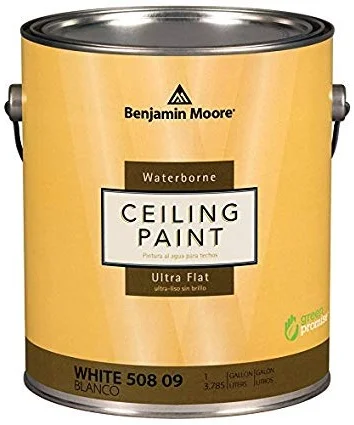
For ceilings, I always use flat paint. Since there is no sheen, it hides imperfections and has a beautiful depth of color. Ceilings tend to be uneven and a flat paint will hide those problem areas and will make the surface look uniform. My absolute favorite product for ceilings is Benjamin Moore Ultra Flat Water Borne Ceiling Paint. It provides a flawless finish and is the flattest finish offered by Benjamin Moore. It is Zero VOC and Engineered with Gennex® Color Technology. Check out my previous post “What’s in Your Paint” for more information on selecting a paint for a healthy home.


Walls
For the walls, I like to use an eggshell finish. It allows for easier clean-ability, but is not too shiny. For walls, I love to use Benjamin Moore Aura in Eggshell finish. It’s a rich and thick paint that provides full coverage, and a beautiful finish with great durability. Good for high traffic areas and it can stand up to repeated washing with no color rub off. It’s a paint and primer in one, mildew resistant, and Zero VOC.
Doors, Baseboards, Trims, Casings, Moldings
I like a satin finish for these wood elements. It’s very durable so it will hold up to normal every day wear and tear. My favorite product for this is Benjamin Moore Aura in a Satin Finish. It’s also great for high traffic areas and it can stand up to repeated washing with no color rub off. It’s also a paint and primer in one, mildew resistant, and Zero VOC.
Bathrooms
Painting a bathroom can be tricky, especially if you don’t want to use a glossy finish everywhere to avoid mildew! Benjamin Moore has a wonderful line of paint called Aura Bath and Spa in a Matte finish. It’s specially formulated for high humidity environments and is mildew resistant. It can stand up to repeated washing with no color rub off. I use this paint on both ceilings and walls in bathrooms for crisp low sheen look.

Cabinets
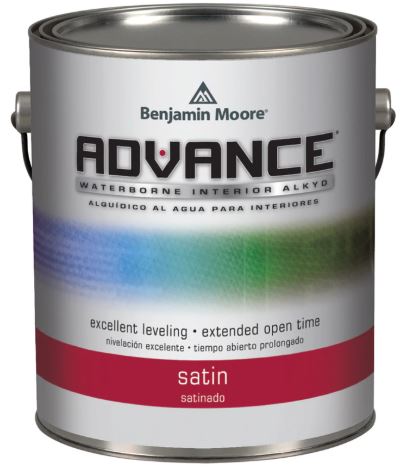
Painting kitchen cabinets is a very technical skill and requires proper preparation. Kitchen cabinets are one of the most commonly touched surfaces and get the most wear. Cabinets must be prepped properly by an experienced painter, primed twice, and then painted. Advance by Benjamin Moore is my “go to” for cabinet painting. As for finish, a paint with some shine is the way to go for durability, so I would avoid Flat paint for this application.
Need More Help with Paint?
Not all paint is the same. Make a conscious effort for your families health by choosing a high quality paint and doing your research on it’s environmental impact. Need help selecting paint colors, finishes, or environmentally friendly products? Schedule a consultation with Sarah Jacquelyn Interiors today! No project too big or small, I love helping my clients specify the perfect paint for their home!

Sherwin-Williams Colormix Forcast 2019
Every year, Sherwin-Williams releases a Colormix Forecast. They take “color of the year” above and beyond, with 6 distinct color palettes that have personality and emotion. After reading about each of them, let me know which palette you feel most connected to!
Every year, Sherwin-Williams releases a Colormix Forecast. They take “color of the year” above and beyond, with 6 distinct color palettes that have personality and emotion. I was able to get a sneak preview of these unique combinations last fall and I’m so excited to share them on my blog today. After reading about each of them, let me know which palette you feel most connected to!
Click below to watch the inspiration video:

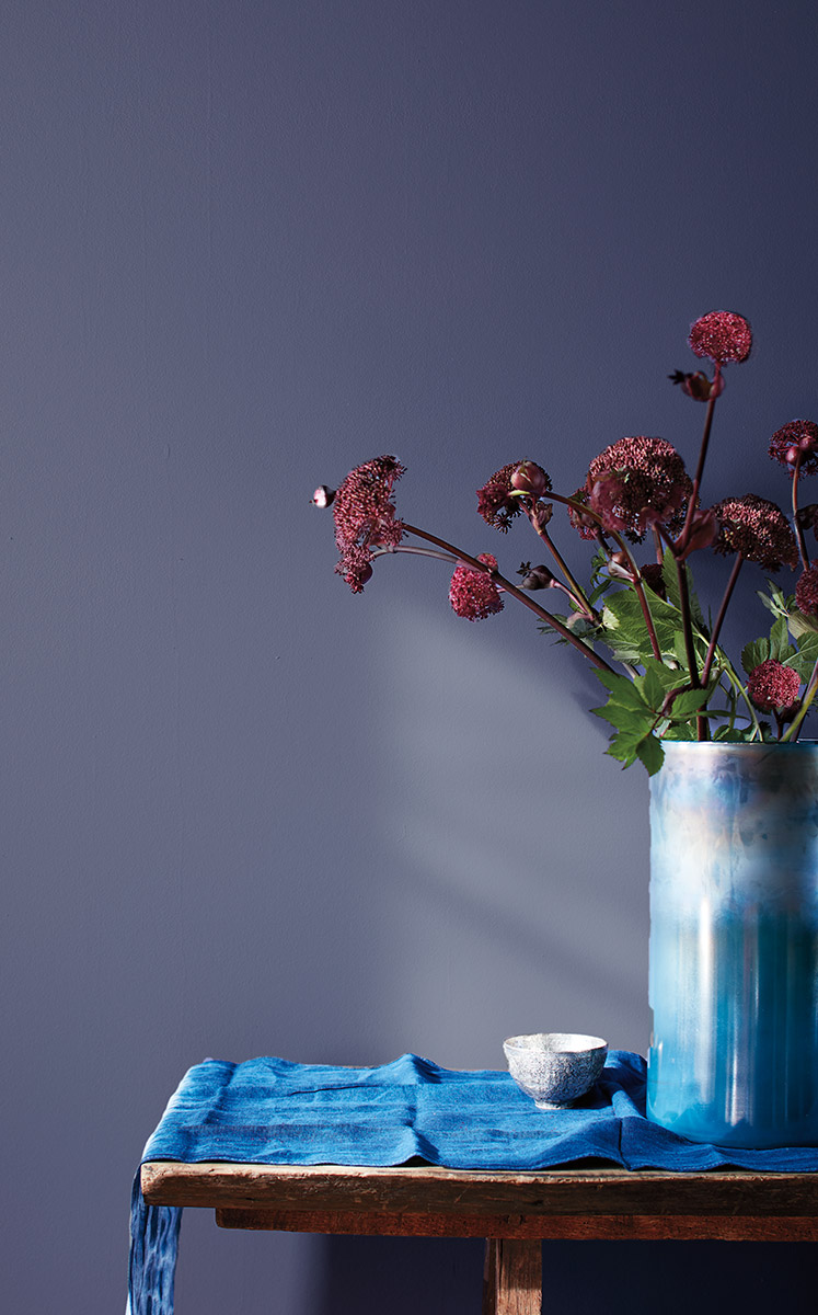
SHAPESHIFTER
“There are those who always seem a little ahead of their time. Visionary and creative, this palette reaches into the cosmos and returns with a whole universe of inspiration. Atmospheric wisps of colors, grounded by deep, dark blues, capture the unique space between technology and spirituality.” (swcolorforecast.com)
RINGS OF SATURN | ARTIFICIAL INTELLIGENCE | SPIRITUALISM | HEALING ENERGY


Shapeshifter is all about cool wood tones, iridescent finishes, metals and crystals.

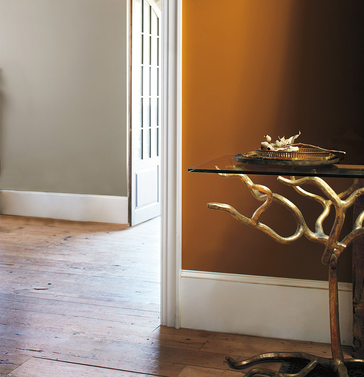
WANDERER
“Some spirits can never be fenced in. They need to soak in the blue of endless horizon and the subtle earthy colors of the high plains and desert. Sun-washed and warm, this palette can be seen in the baked clay canyons, worn leather and woven wool blankets of the true New West.” (swcolorforecast.com)
CAREFREE BOHEMIAN | MODERN COWGIRL | UNBRIDLED ADVENTURE | SOUTHWESTERN TWIST


Picture warm wool blankets, rustic warm wood tones, camel colored leathers. Think lots of natural materials, and sustainable living, the modern farm house. This palette moves away from the high gloss finishes and metallics.
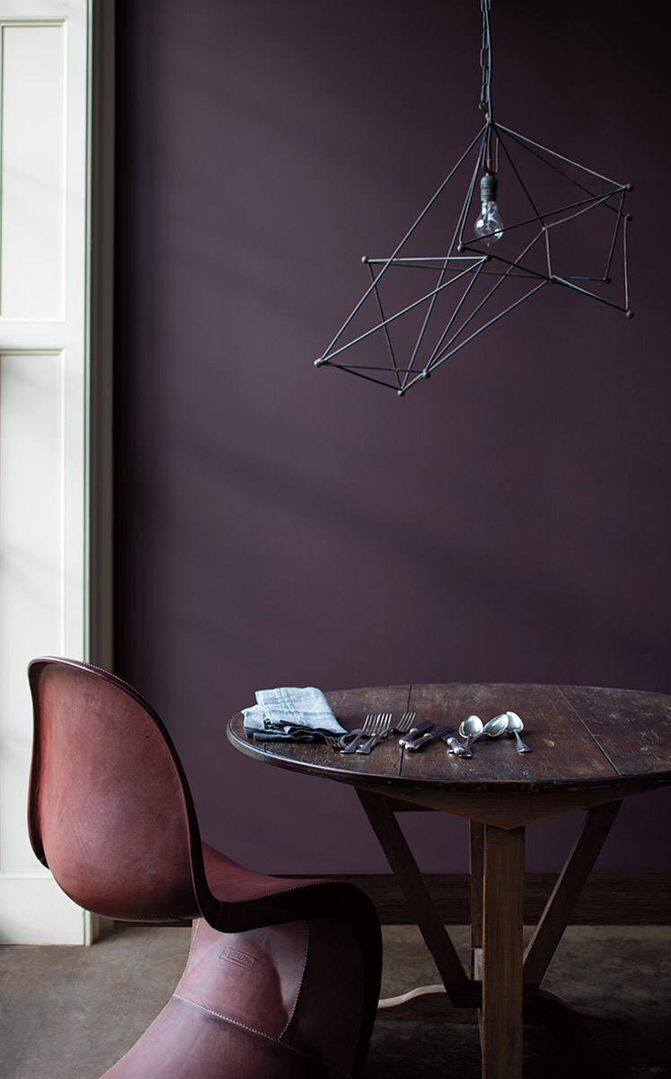
AFICIONADO
“Devotees of the best in life appreciate the well-worn, the bespoke and the rare. Like a bookcase of leather-bound classics, this polished palette evokes nostalgia and timeless tradition. With copper and gold anchored by merlot and deep, dark gray, these tailored tones make everything feel impeccable, tasteful and elegant.” (swcolorforecast.com)
READING NOOKS | BRITISH ACCENTS | TWEEDY MENSWEAR |'60S NOSTALGIA


Aficionado is all about mixing and matching styles and eras. Think warm modernism that is comfortable, yet contemporary. The epitome of the bibliophile.

ENTHUSIAST
“There are those who don’t know the meaning of “less is more.” Passionate and eclectic, they have a calling to be unique. They embrace the details and create scene-stealing worlds that burst with beauty. The proof is in this palette that features bold pops of vivid color, maximum impact and lots of energy.” (swcolorforecast.com)
MAXIMALISM | COZY CHAOS | OVER-THE-TOP OPULENCE | MORE IS MORE


Maximalism is on its’ way back! Think confident, bright colors that celebrate personality and self expression. Layered collages, mixed patterns and textures, and unique wood finishes set this palette apart.

NATURALIST
“Walking barefoot in the garden, nature lovers instantly connect with the wonder of the world in full bloom. With roots in the forest, this palette’s colorful tendrils grew in hothouses and conservatories until they became these lush, sophisticated tones. Ranging from mushroom to leafy green to passionate floral pink, they’ve now found a place where they’ll never fade.” (swcolorforecast.com)
FOREST MUSHROOMS | BOTANICAL PRINTS | BUTTERFLY COLLECTIONS | TERRARIUMS


Botanicals, terrariums, and intricate details, Naturalist is about bringing the outside in. Characterized by worn wood textures and layered plants, this palette is whimsical, yet crisp.

RACONTEUR
“From ancient sagas to today’s motivational speakers, we love our storytellers. With colorful accounts they sum up our very nature and remind us how we’re all connected. Passed from grandmothers, traders and nomads, the tales traveled the world, gaining artistry, until we’ve translated them into a rich and modern palette that spans space and time.” (swcolorforecast.com)
DESERT OASES | GLOBAL STYLE | LUXURY SAFARIS | SPICE MARKETS

Raconteur means story teller. Characterized by global influences and natural materials, this palette captures our attention and connects us through a design story.


What’s in Your Paint?
Paint is paint, right? Why pay more for the same color? Not all paint is created equal and good quality paint comes at a price. Let’s dive into what really goes into a high quality can of paint that makes it worth the extra money.
It’s no secret that I love color! On the floor, furniture, and walls, I love working with my clients to get just the right balance that reflects who they are and makes them feel at home! Paint is one of the easiest and most cost effective ways to change the mood of your home or office. Aside from picking a stunning new color, there are many other factors to consider before breaking out the rollers. The finish, brand of paint, product line, environmental impact, and the health and safety of your family should all be considerations. Not all paint is created equal. So what’s the difference? Paint is paint right? Why pay more for the same color?
Good quality paint comes at a price. Let’s dive into what really goes into a can of paint to make it worth it. There are four main components in a gallon of paint: pigments, liquids, additives, and binders.

Pigment
Pigments are the finely ground particles that impact hide and color. There are two types of pigments that go into a can of paint. The first and most important are the prime pigments, they provide color and hide. The second are extender pigments, they add bulk to the paint, but do not really affect the color. Higher quality paints have more prime pigments providing an easier application, increased durability, and better color retention.
Liquids
The liquid is the carrier that helps get the paint from the can onto the wall. The liquid itself does not affect the quality of the paint, but rather the ratio of liquid to pigments and binders is what makes a top quality paint. The greater the ratio of solids to liquids, the higher quality the paint.
Additives
Additives are the extra ingredients that give a paint it’s specific performance characteristics differentiating from one paint to the next. Common additives in higher-quality paints include: Increased leveling agents to make the application process easier, microbicidal and anti microbial technology, preservatives to prevent spoilage, oder eliminating technology, and many more.
Binders
Binders provide adhesion and resistance to cracking, blistering and peeling. Latex paints use 100% acrylic, styrene-acrylic, or vinyl acrylic as a binder, while oil based based typically contain modified oils called alkyds like linseed oil and soya oil. The type, quality and quantity of binder affect everything including stain resistance, gloss, adhesion and crack resistance. Higher quality binders adhere to surfaces better and provide longer lasting performance.

BenjaminMoore.com

VOC’s and Paint
You probably know your breathing in chemicals when you smell a freshly painted room, but how bad can they be? What your smelling is VOC’s (volatile organic compounds), carbon-containing compounds that vaporize into the air. Once they enter the air, they react with other elements to create ozone, which causes air pollution and health problems. You may experience breathing problems, burning or itchy eyes, headaches and nausea. VOC’s are a even linked to certain cancers. VOC’s are found in many building materials, including paint.
The specific VOC’s in each paint vary by each manufacturer. It’s hard to know if your product contains VOC’s, as the manufacturer is not required to reveal all ingredients in their product. Most colorants will add VOC’s to the finished product, even paints that are formulated to be zero VOC don’t always maintain that level when it comes time for application. Federal VOC limits are currently set at 250 grams per liter (g/l) for flat paints and 380 g/l for others, but this can vary state to state. Low-VOC is usually 50 g/l or less and no-VOC is usually 5 g/l or less.
There numbers are for the base coating, adding colorant adds VOC’s to the base, and the person mixing the paint is not going to be able to tell you how much more was added. Typically the darker the color, the higher the VOC’s. Fortunately, there are innovative color technologies available now that won’t add any VOC content when adding pigment.
Benjamin Moore
Benjamin Moore and Sherwin Williams have both created Zero VOC paint formulas that don’t add any VOC’s to the paint even after adding colorant. Benjamin Moore’s no VOC technology is called Gennex.
“When we launched Gennex, we were the first company in the U.S. to introduce a zero-VOC (Volatile Organic Compounds) waterborne tinting system. The innovation of Gennex enables our zero-VOC paints to remain zero-VOC even after being tinted with Gennex colorants, an impossibility with generic, all-purpose colorant.
Gennex is a testament to Benjamin Moore’s dedication to meet or exceed the most stringent environmental standards. With over 3,500 colors, you can pick the exact color you need, and know you’ve been environmentally responsible with each and every one of them.” (BenjaminMoore.com)
Need More Help?
Not all paint is the same. Make a conscious effort for your families health by choosing a high quality paint and doing your research on it’s environmental impact.
Need help selecting paint colors, finishes, or environmentally friendly products? Schedule a consultation today! No project too big or small, I love helping my clients specify the perfect color for their foyer, living room, or office!


Behind the Scenes: Dining Chair Reupholstery
I’m so excited to share a behind the scenes look at my most recent reupholstery project! These antique chairs needed some TLC. Finished just in time for Thanksgiving, these newly redone chairs are sure to be the talk of the dinner table! Special thanks to my favorite upholstery shop, Covers Unlimited and my go to leather source, Garrett Leather for being invaluable partners in the completion of this project!
I’m so excited to share a behind the scenes look at my most recent reupholstery project! These antique chairs needed some TLC. We cleaned them up, repaired the wood frames, replaced the suspensions and cushions, and reupholstered them in a beautiful new textured leather that you’ve just got to see to believe! We did all this while still maintaining the beautiful antique quality and kept the overall aesthetic of the home in mind. Finished just in time for Thanksgiving, these newly redone chairs are sure to be the talk of the dinner table! Special thanks to my favorite upholstery shop, Covers Unlimited and my go to leather source, Garrett Leather for being invaluable partners in the completion of this project!
The Current Chairs
Truly unique, these chairs were originally upholstered in giraffe hide! The chairs definitely needed some work as the hides were stiff, cracked, and torn making them incredibly uncomfortable to sit on. Covers Unlimited carefully removed the old hides, as my client wanted to preserve the material for an up-cycle project. They took extra caution to care for the wood during the removal process.
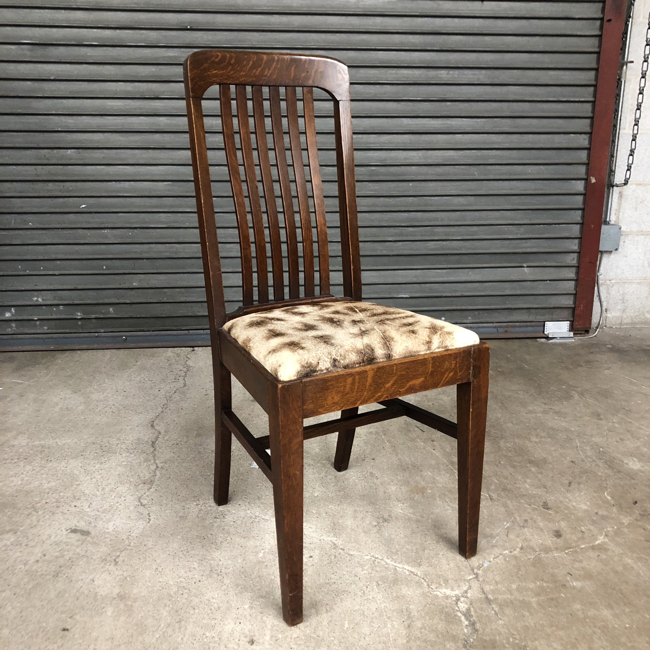

Next, the wood frames needed some attention. We did not do a full refinish, but just a basic wood touch up. The existing wood finish was in fairly good condition expect for a few nicks here and there. Some of the chair frames were cracked and needed wood repair. Covers Unlimited took care of the damaged areas while preserving the antique quality. All of the chairs received new suspensions, durable high resilience foam, along with frame tightening. I really appreciated their attention to detail.
One of the best things about working with Covers Unlimited is having a dedicated project manager that works with interior designers. Susan Rix, the Design Project Manager has a background in design and an amazing eye for detail! I love being able to trust that my clients’ furniture is in good hands.


Selecting A New Leather
One of my favorite parts of my job is exposing my clients to beautiful new products they could never even imagine. Part of that process involves educating my clients on quality, value, and what makes one product different from another. Leather in particular is complicated. It can be difficult to understand the qualities and grades of leather. If you’re interested in learning more about semi- aniline, pure aniline, top grain, full grain or other leather terms, check out this fantastic resource from Garrett Leather.
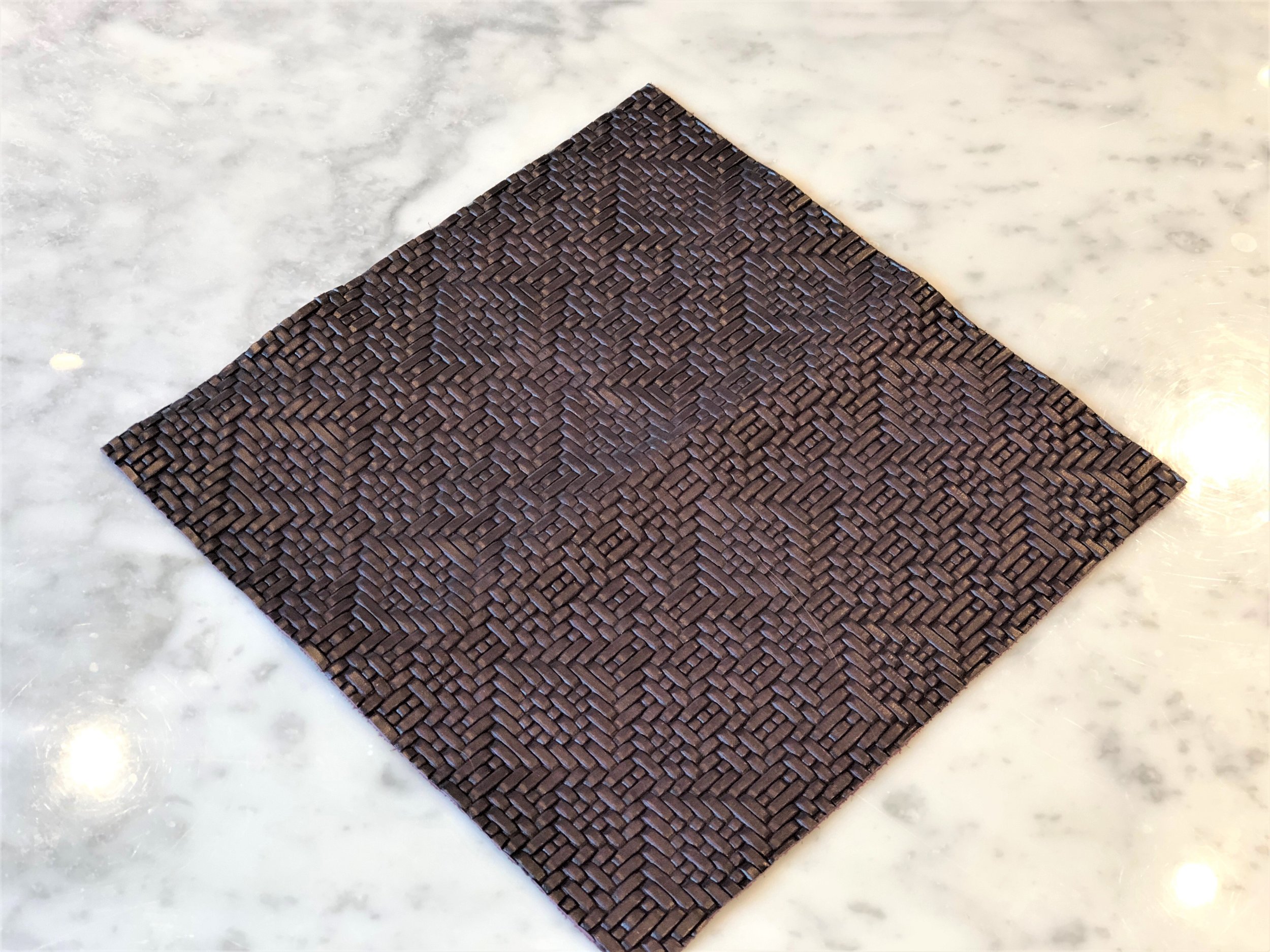
For this project we wanted something that was easily cleanable, aged naturally, and would compliment the antique characteristics. We started with rich espresso tones, made our way to burgundy, but ultimately decided on a deep plum color that complimented the other colors and finishes in the room. To give it an even more one of a kind look and feel, we studied a variety of impress patterns from Garrett. We selected a pattern that complimented the scale of the oriental rugs and went well with the other motifs in the room. We selected Journey Majestic Mountain from Garrett Leather with Impress Bases.


When ordering leather, it’s always a good idea to order a dye lot cutting for approval. Since leather is a natural material, each hide may take the dye slightly differently than the last. A CFA is a small piece cut from the exact hide that you will be ordering. This allows you to review the hide and make sure you are happy with the color and texture before placing the order. After we approved the cutting, we ordered a strike off. The strike off is a impressed sample on the exact hide/dye lot we approved. Our strike off was about 12”x12” which allowed my client to get a good sense of the pattern on our selected leather color.
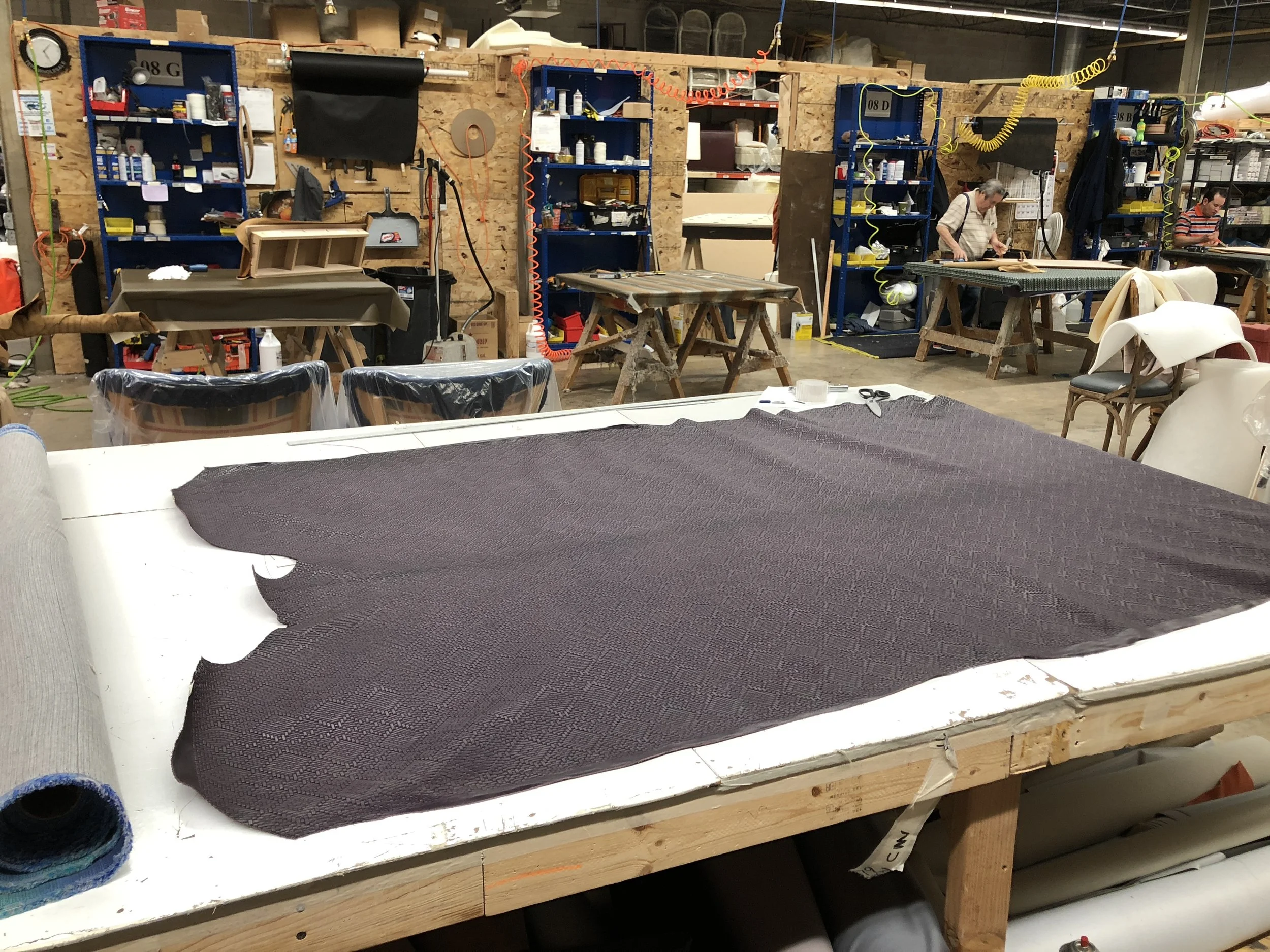
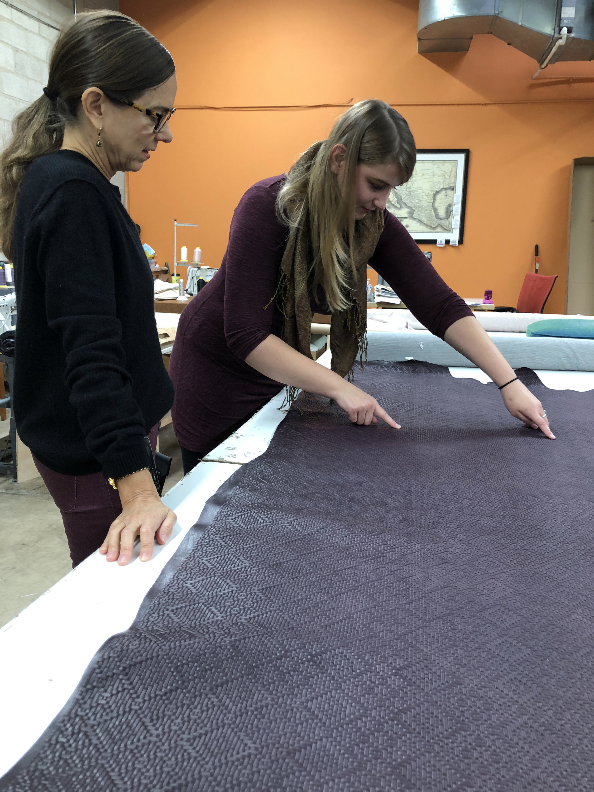
Rolling Out The Leather
Now comes the moment we’ve been all been waiting for, rolling out the new leather! Over the past 2 month we’ve been looking at small samples and have yet to see the full hide of our new leather. When the hide arrived, I went over to Covers Unlimited to inspect it and talk with Susan about how we would lay out the pattern on the chairs, making sure to be conscious of plate lines and repeats.


The Finished Chairs & Client Testimonial
“Reupholstering my dining chairs totally upgraded my dining room! I never knew changing one element could transform an entire room. When I started the process I knew I wanted leather, but was just thinking “medium brown.” Sarah brought sample books to my house and I discovered a whole new world of color and texture! She educated me on the different qualities of leather, leather dye lots, and how different leathers age over time. She helped to narrow down my options based on our family’s needs and budget. She handled everything from ordering the leather to coordinating transportation for the chairs. She double checked everything and made sure she had our approval every step of the way. She expedited the entire process and even delivered our beautiful custom chairs 2 weeks ahead of schedule! My dining set is antique, mission style, golden oak. Sarah’s eye for detail and sensitivity to, not only the individual item, but to the entire mood and aesthetic of our home has helped us to restore the set to its original beauty. I highly recommend Sarah to anyone who needs help with their home. Thank you!” - Julia


Design School 101: Wool Fibers
As a Interior Designer, I work with fabrics, carpets, and soft goods everyday. Understanding the properties of textiles is key to being able to make the right specification for the client. The inherent natural properties of wool make it a captivating choice the home or office. Here are the basics understanding wool as a fiber in interior design.
As a Interior Designer, I work with fabrics, carpets, and soft goods everyday. When specifying textiles I consider fiber content, durability, color fading, wear resistance, cost, longevity, environmental impact and if it’s appropriate for the specific application. Understanding the properties of textiles is key to being able to make the right specification for the client. The inherent natural properties of wool make it a captivating choice the home or office. Here are the basics understanding wool as a fiber in interior design.

https://www.woolmark.com/collaboration/interiors/striking-a-balance-2/?enforce=true
Synthetic vs Natural
First things first, fibers are generally broken down into two categories: Synthetic and Natural. From there, natural fibers are further broken down into cellulosic, plant based like cotton and linen, and protein based like wool.
Wool Production
Wool comes from the fleece of the sheep. The process by which wool is cut off from the sheep is called shearing. After sheering, the wool is sorted into 4 categories by quality: fleece, broken, bellies and locks. The quality of the wool is determined by a professional and is called wool classing. The most important factor is sorting the wool is the fiber diameter, along with crimp, yield, color and strength. The crimp and elastic qualities of wool make it different from hair and fur. The quality of the crimp corresponds to the fineness of the wool fibers.

Merino Wool
Most commonly known, is Merino wool. Southwestern Spain held a monopoly on the trade up until the 18th century. Modern Merino wool can be found in New Zealand and Austria. Even today, Merino sheep are still regarded as having some of the finest and softest wool of any sheep. What makes their wool so soft is that they have up to 100 crimps per inch. Corser wool may have as few as one or two crimps per inch. Less crimps decreases the ability to bind into yarn.
Global Production
Globally about 2 million tons of wool is produced. 60% of that goes into the apparel industry, only 3% to the textile market. Australia, China and New Zealand continue to be the three top produces of wool.
Color Considerations
Wool is naturally a creamy white color, although some sheep produce natural colors like black, brown and silver. Keep this in mind when designing a custom wool rugs. You will never be able to get a true “bright white” since wool naturally has a creamy undertone.
http://www.sassysewing.co.uk/is-wooly-wooly-warm/
Carpet
When it comes to carpet, we all love the look an feel of a natural wool, but the upfront cost is an investment. Wool is one of the best natural fibers to use in carpets as it is very durable and resilient. It has a superior hand and appearance. Each fiber on it’s own is relatively week, but together the fibers are resilient have and excellent elasticity. Wool is naturally resistant to soiling and cleans very easily. A wool carpet should last 10 years with proper care before showing signs of wear on the major walk ways. Wool carpet will keep it’s appearance longer than synthetic carpets.

https://www.woolmark.com/collaboration/interiors/striking-a-balance-2/?enforce=true
Fabric
Wool is a great fabric to use for window treatments and upholstery because of it’s resiliency. Crimps and creases fall out easily. Wool fabrics are often bulkier than other textiles because of the natural crimp keeping the fibers together, but allowing more air to be held. This causes the fabrics to retain heat.
Fire Factors
Although wool will ignite and burn at high temperatures, it has a low flame spread rating and will self extinguish when removed from heat. It has a low rate of heat release and combustion. It will not melt or drip when ignited. In the event of a fire, wool contributes less to toxic gases and smoke then other fibers used in carpets. This makes it an ideal material to be specified for high safety environments like trains and aircraft’s.
Environmental Factors
Wool is an all natural and renewable fiber. Wool products have a longer life span than other fibers. Wool is naturally antibacterial and antimicrobial. It contains fatty acids and inhibit the growth of mold, mildew and bacteria. This means that wool products do not need to be washed as frequently. Wool is recyclable! It can be shredded into individual fibers and converted into a new product. Once it eventually does reach the end of its life, wool fiber is naturally biodegradable!

https://www.millerwastemills.com/materials/wool-fiber/

Go ahead, touch the walls!
Benjamin Moore just released a line of paint with a soft touch matte finish and it’s absolutely beautiful.
Benjamin Moore just released a new line of paint with a soft touch, matte finish and it’s absolutely beautiful. With the smoothness and texture of a soft leather glove, there's no other paint like it. Last week, I was able to see this unique paint in person at the Merchandise Mart showroom. This finish is truly an amazing texture. Century comes in 75 pre-mixed gorgeous colors that are deeply pigmented to perfection. These rich autumn colors are inspiring me now.
Click here to learn more.


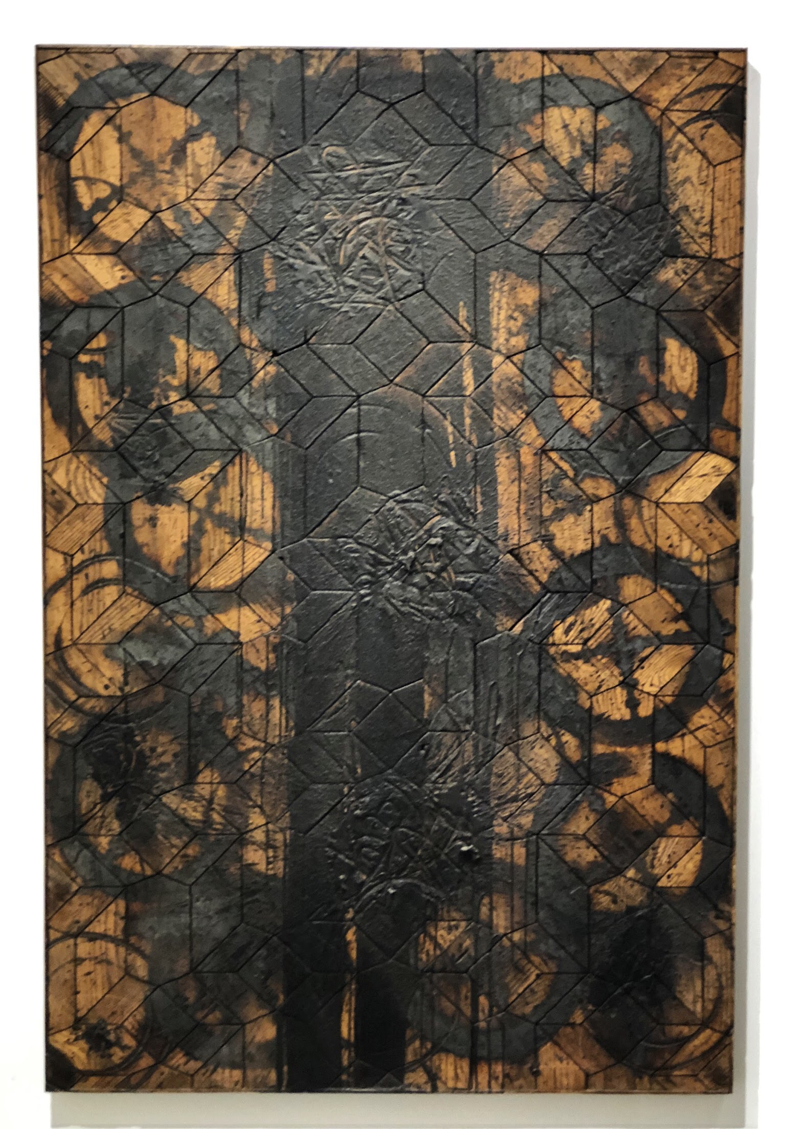
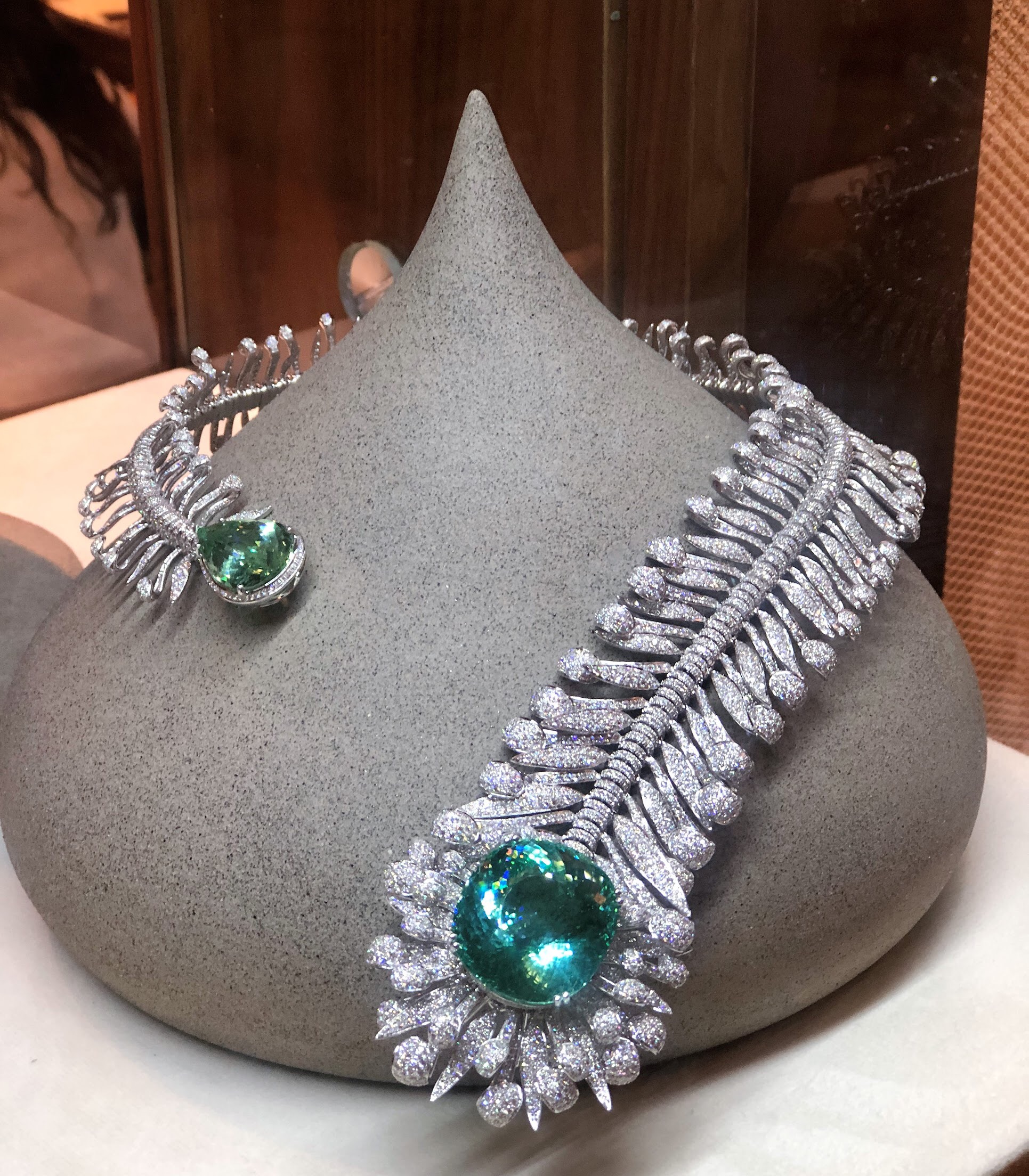
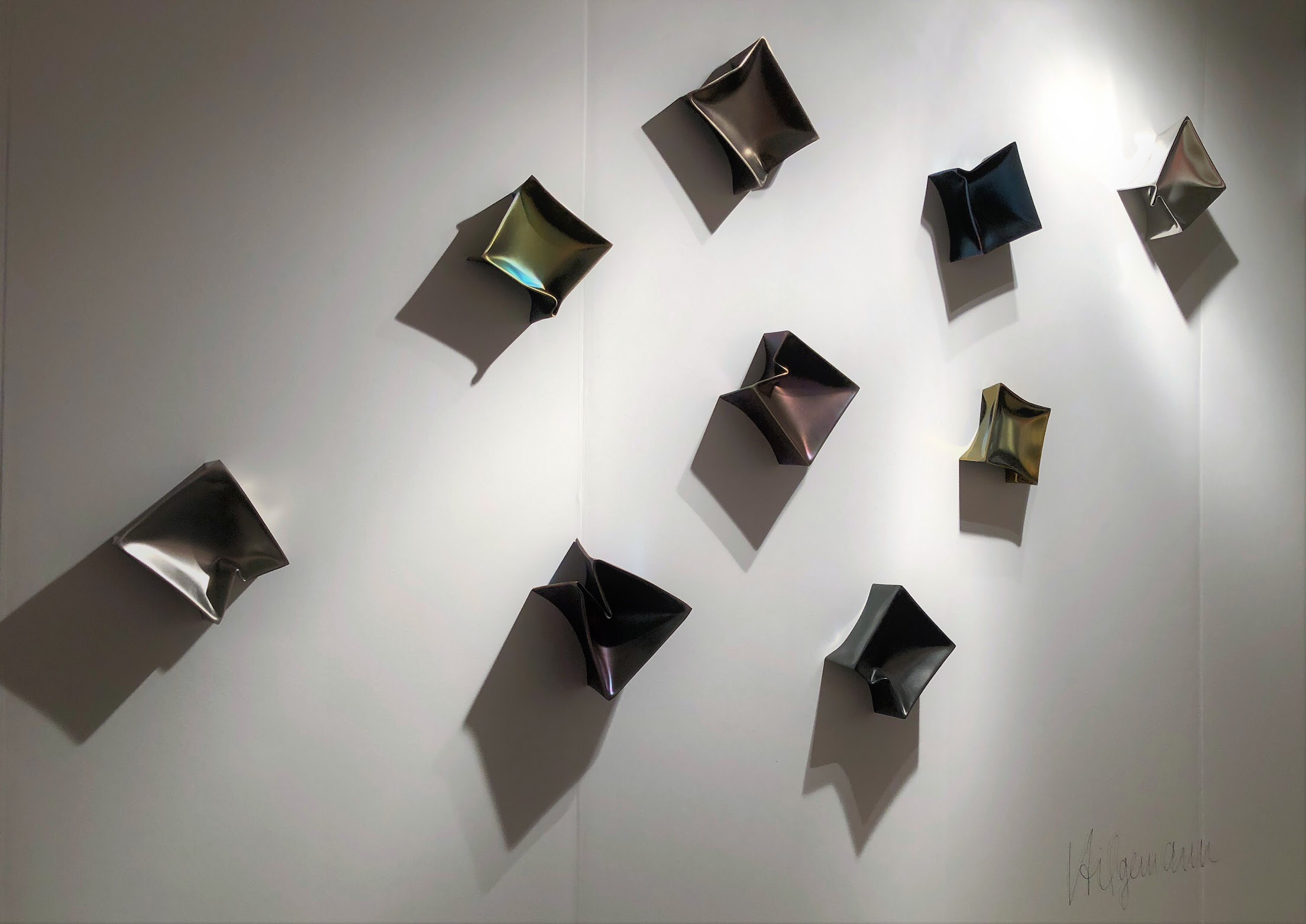
Exploring EXPO Chicago
This year I was fortunate enough to attend EXPO Chicago, thanks to Brizo and Delta Chicago’s Young Designers Night. EXPO is the International Exposition of Contemporary & Modern Art at Navy Pier.
This year I was fortunate enough to attend EXPO Chicago, thanks to Brizo and Delta Chicago’s Young Designers Night. EXPO is the International Exposition of Contemporary & Modern Art at Navy Pier. Every time I attend one of these large shows at Navy Pier, I’m always astounded at how large the facility is and how many artist’s work is on display. There are hundreds of international contemporary art galleries featured and something for everyone’s taste! It was amazing seeing all of the original contemporary art. Nights like this leave me feeling inspired! Here are some highlights from the evening.


Beyond the Color Wheel: Indigo
Indigo, the color of elegance, strength and wonder. It can stimulate clear thinking and captivates the imagination.
Indigo, the color of elegance, strength and wonder. It can stimulate clear thinking and captivates the imagination. Indigo is a dramatic color that creates a bold impact. Don’t be afraid to use a dark color in a small space. Indigo is a great choice for a powder room. It adds a richness and creates a cozy environment that is sure to wow your guests. Indigo also emits feelings of luxury, making it a great choice for a library, bar, entry or formal living room.

Photo Credit: @rededition
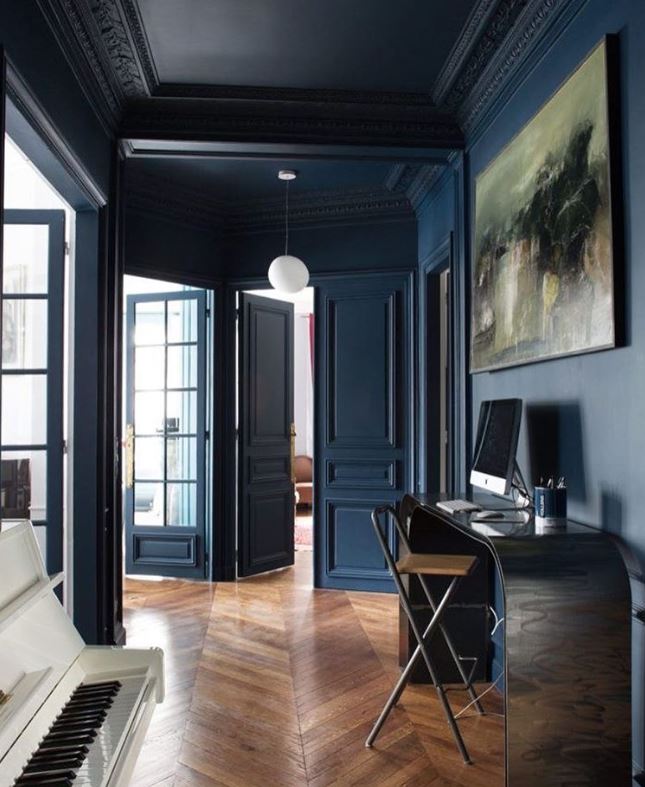
Photo Credit: @volcanod
While we see and use color in our everyday lives, rarely do we think about how that color has come to be. Indigo has an interesting history from being harvested as a natural dye, to the synthetic reproduction in the late 1800s and even it’s discovery on the color spectrum.
The history of indigo dates back to 4000 BC in what is now modern day Peru. The color indigo is named after the dye that is derived from the Indigofera Tinctoria plant. Though the complicated process has been modernized by machines, creating natural indigo dye is incredibly cumbersome.

“First the greenery was fermented in an alkaline solution. The liquid was then drawn off and vigorously beaten to aerate it. This caused a blue sediment to form, which was then dried into cakes or blocks to be sent off to market.” (The Secret Lives of Color)


Photo Credit: ayafiberstudio.com
In the 1660’s, Isaac Newton discovered that indigo was one of the seven base colors. He projected a beam of sunlight through a prism to create the rainbow,
“The...primary colours are, Red, Yellow, Green, Blew, and a Violet-purple, together with Orange, Indico, and an indefinite variety of Intermediate gradations.”

Culturally, indigo is found in the burial customs of many cultures. The ancient Egyptians dyed the edge of their burial linens with indigo. In fact, most of the Tutankhamun’s wardrobe was indigo.

Blue Kerchief from Tutankhamun's Embalming Cache
Today, most indigo dye is synthetic. Indigo was first synthesized by Adolph von Bayer, who identified the molecular structure of natural indigo and recreated it in a lab. This allowed indigio to be made on demand. Synthetic dye is more durable and does not lose its pigmentation as quickly over time. Most commercial denim is made using synthetic indigo. Though synthetic indigo is more readily available and cheaper, it does not have the same quality and depth as natural indigo.

Whether synthetic or natural, indigo is not going anyway where. This thousand year old color maintains its appeal in interior design, art, textiles and fashion.

Bonus fact: It was discovered in 2008, that when a banana becomes ripe, they glows indigo under a blacklight. This allows animals who see ultraviolet to know when a banana is ripe and ready to eat.
